It Was 20 Years Ago Today Part Two: A-Ha!
Looking back on my art school days at Sheridan College, and how I developed my personal style.
Continued from my last post, remembering the very earliest days of my career, and my training at Sheridan College in Oakville, Ontario. As I said in the last post, so much of this is based on memory and old snapshots, so it’s only as accurate as my ageing brain.
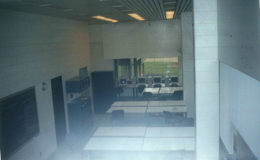
The post-graduate course had only ten members, so there was always a sense that we were among the elite at an already elite school. We had our own dedicated studio space that only we had access to, through an RFID card, which at the time felt like something right out of Star Trek. It was outfitted with an adjustable drawing table for each student, as well as the most cutting edge Mac computers available at the time. Scanners, Wacom tablets, laser printing, even 3D animation software was ours to experiment with.
It was a diverse group, with one student in her fifties, one student who had transferred that year from China, several in the course were married, a few were parents. I was on the low end of the age spectrum at 22, I think there was only one guy younger than me, but he’d been taking undergrad courses at Sheridan and therefore knew the lay of the land a lot better than I did. Besides being young, I was also incredibly green, and so I was very fortunate that the group found my wide-eyed naiveté charming rather than annoying, and were helpful in showing me the ropes. Still, among that group of skilled artists and refined thinkers, I never could fully shake off the imposter syndrome. What was this bumpkin from the prairies doing all the way out there?
Dream Schedule
It’s funny as I look back now, because my memories of the time are so tinged with stress and pressure. But on paper, the course’s weekly schedule seemed pretty manageable.
On Mondays we had our mentorship group, where three or four of us would meet with an assigned artist mentor. The entire lineup of instructors we had were the top illustrators in the Toronto area at the time (or ever), so there really wasn’t a bad one in the bunch. But I still felt I lucked out getting assigned to Kathryn Adams, a warm, experienced illustrator with a sharp business sense.
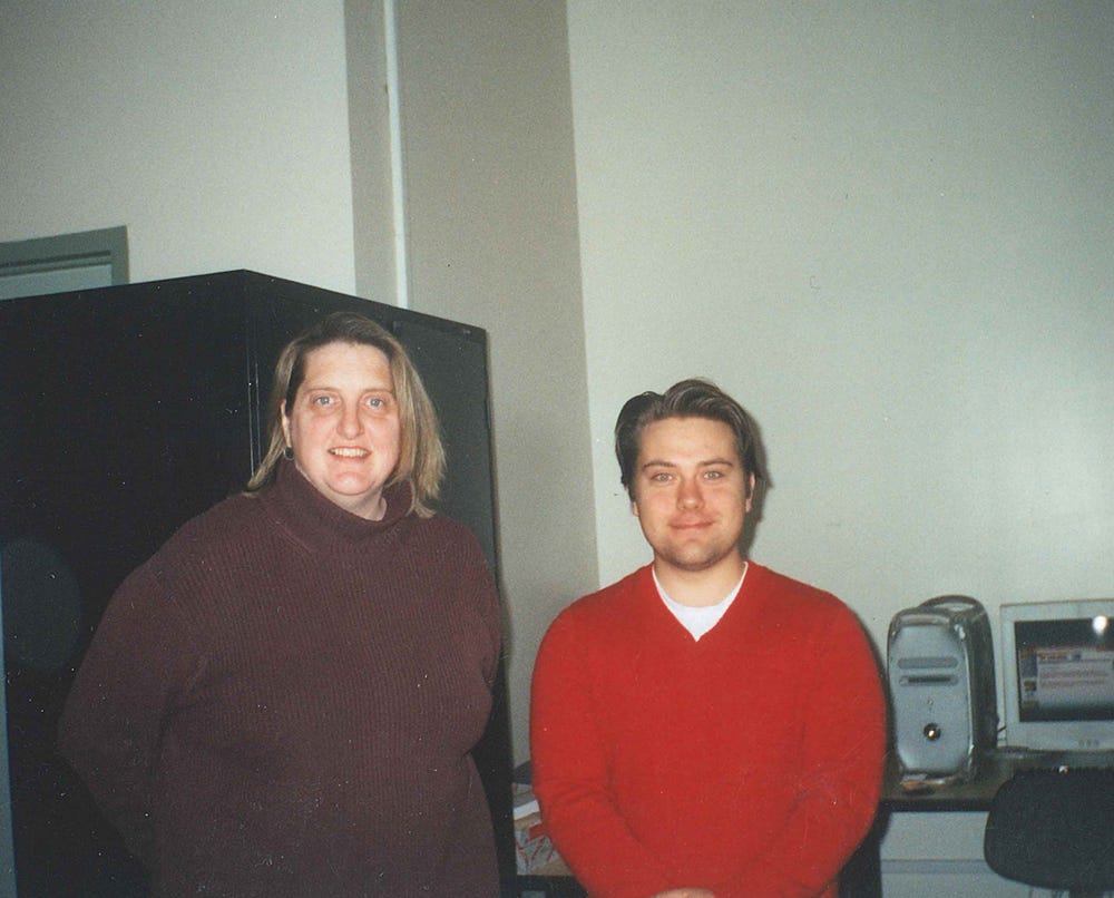
Her humourous and encouraging energy suited my ‘mama’s boy’ personality well. Her critiques were no-nonsense, but, more than the other mentors, she seemed to be able to express her negative notes without absolutely devastating a person (most of the time!). No copy of my class schedule survived all these years, but I’m fairly sure Mondays were just a half-day, 9am-12pm.
Tuesdays we were at school all day, 9am-3:30pm, non stop life drawing with the Illustration program head, Joe Morse. Though I was no stranger to model drawing from my years at the U of S, Joe’s tutelage and the models themselves made it a very different experience than what I’d encountered back home. As one of the more photo-realistic renderers in our class, Joe was always pushing me to play more with form—exaggerate, dramatize, synthesize.
Not merely to transcribe what was in front of me, but tell a story with the way I drew it. The other difference was in our life models. Back at the U of S, the models were typically hard to find. More often than not they were either retirees or fellow students in our programs—this made for a wide diversity of body type. But at Sheridan, the models were actual models, some of the fittest people I’d ever see and certainly the most physically conditioned people I’d ever drawn. Seeing the musculature in play, the tension of the poses within the body was largely a new challenge for me.
Wednesdays the entire group got together in our studio, for business classes, and for the guest mentor sessions. In the business course, we learned the practical side of applied arts—building websites, creating promotional materials, invoicing, creating a client base. All of it was completely invaluable, and I still fall back on the tools and habits from that course these two decades later.
And that was it! A three day school-week, with the next FOUR DAYS being dedicated to completing the assignments on our own time. I can’t remember now if we really had all that many assignments, or if the pressure was just coming from myself—to create work worthy of my peers and mentors, but I’d use every minute of those four days most weeks.
“Too Comic Book-y”
An early challenge I had at Sheridan was that the training we were receiving was really to become a freelance editorial illustrator, and I entered the school with my heart set on being a comic book artist. A bunch of my peers in the course (and even some of my instructors) shared my love of sequential storytelling, but all were in agreement—mainstream comics were too limited. They didn’t pay enough, the publishers owned your work, and there wasn’t enough opportunity for personal artistic expression. To put it simply, the dominant thinking was that mainstream comics were for suckers. I felt torn—I loved comics (my mom was dutifully buying the stack from my pull file each month) but felt a pressure to stay away from the comic-book style in order to succeed in my classes. That first semester, my work was all over the place, as I tried to force a new style on myself, from the outside in, always trying to avoid my work looking too comic-book-y. I did a lot of paintings, most of them too terrible to share here. I do remember one critique, on an early assignment, where my instructor looked at my painting in silence for a very long time, before summarizing, “Ok, you’re colour-blind. We can work with that.” (I’m not!)
Even when my concepts were good, I was undone with my execution.
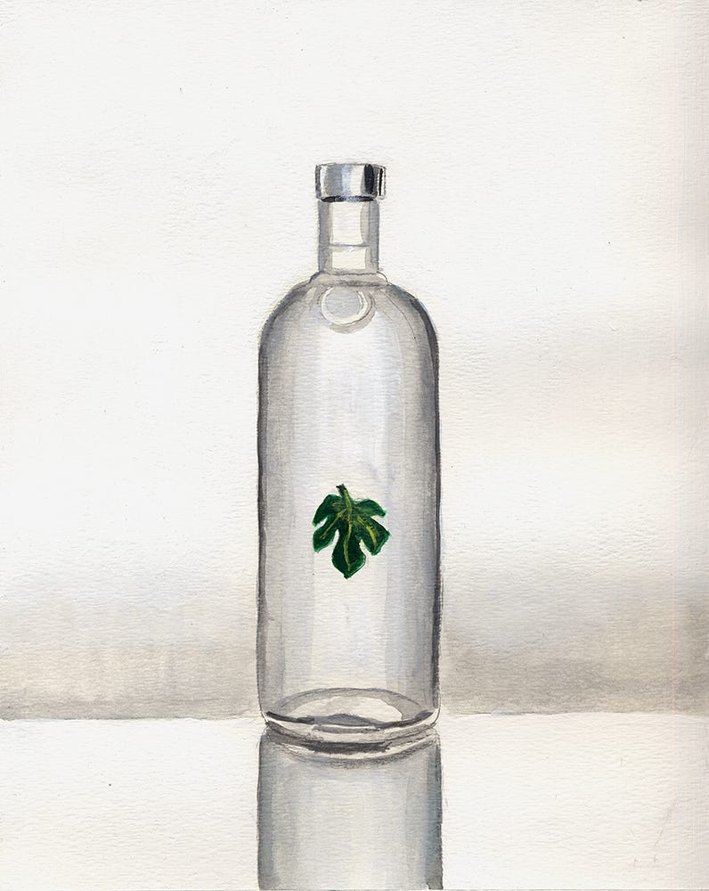
One assignment we had was to create a piece for the Swedish Vodka company, Absolut, then known for their playful ads with the unique bottle shape. My idea was “Absolut Eden” with a bottle wearing a fig leaf.
The critique for this was brutal, but accurate. “Why would Absolut hire you to paint this, when they could get actual photorealism from an illustrator like Tim O’Brien?” And they were dead right—in attempting hyper-realism, but failing, I was creating something both unpublishably sloppy, but also completely devoid of personality or my own style.
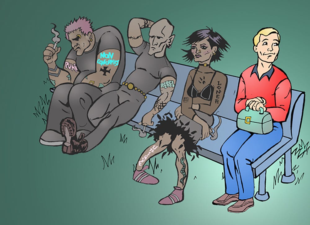
Another assignment was to illustrate superstition. Again, I kinda liked my concept (which felt a little like a Gary Larson idea from “The Far Side”) but was let down by how it looked.
The critique: “So you’re doing political cartoon artwork now?”
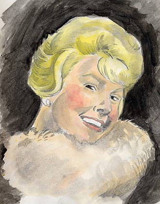
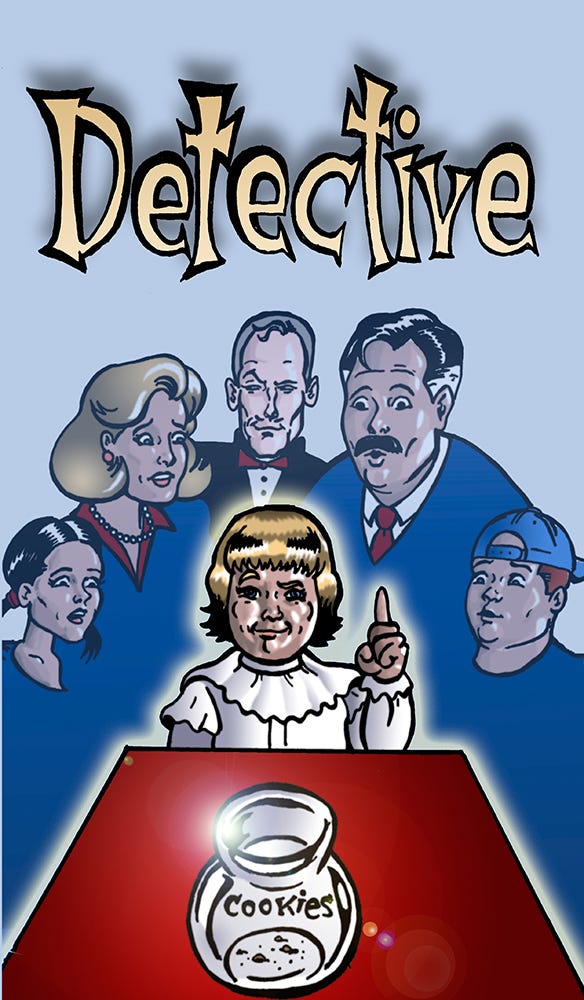
Other times, in the absence of my own style, I would just ape the style of others. Namely, my mentor Kathryn Adams. Her illustration work was so concise and economical, with cheery, sparse pastel colour daubed overtop of her inimitable linework. So I tried that, too.

No matter what style I tried, the critique was generally the same—too comic book-y!
Too comic book-y!
Too comic book-y!
Meanwhile, in my private sketchbooks, where I could just do art the way I wanted to, style just developed naturally, and most all of my doodles had a distinctive, but common look.
Everything I drew just came out of me with a vintage feel (and certainly, retro pop culture was a passion of mine, just given the subjects I was drawing).
Even modern artists looked like they stepped out of Hush Hush Magazine.
But no one was seeing that stuff. I went home for Christmas feeling a little like I was drowning. I knew from the critiques that I was struggling with the work, especially when my peers were doing such unique and successful pieces. If Sheridan really was the Big Leagues, I would have been sent down to the minors. The harder I tried to run from my retro, comic-book influences, the more people seemed to find them in my work. Partially out of frustration, partially out of desperation, and partially out of pride in my sketchbook work, I resolved to stop trying to come up with a style for my assignments, and just respond to the work as I wanted to, as naturally as I could.
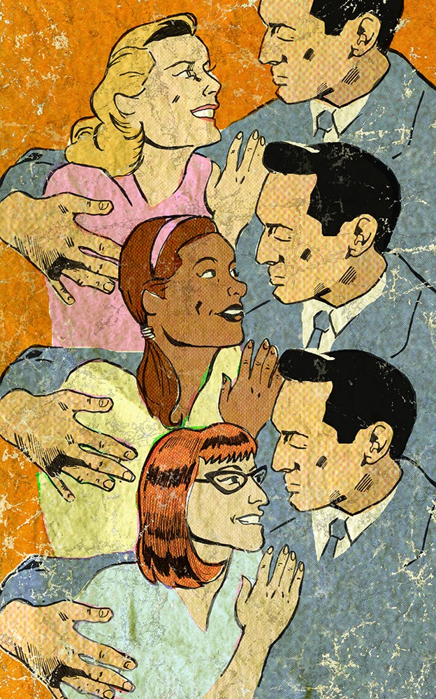
The first assignment when I got back after the Christmas break was on the subject of racial profiling in Toronto, a serious subject if there ever was one. The assignment was for a spot illustration—a smaller image that would accompany a shorter article, but would ideally still add dimension and definition to a reader as to what the story was about. I quickly sketched out a simple scene, of a black motorist dubiously lowering his window to speak to a police officer. As this was a smaller illustration, I wanted the image to “read” quickly. While I could have added specific details, like accurately depicting the uniforms worn by Toronto City Police, I instead just drew it in broad strokes—a stereotypical beat cop, in the mold of Chief O’Hara from the old Batman show. I quickly committed the scene to ink, and set about colouring the drawing.
For Christmas, my sister had given me a calendar of old Superman comic book covers, which I treasured. As the calendar was pretty big, the usually 7¾” W x 10½” golden age covers were enlarged over a much bigger area than their original print resolution. I loved how the off-register Ben Day printing on yellowed newsprint looked when blown up larger than real life. So I asked myself if I could try to recreate that look in the colouring of the piece. It was a bit tricky, to apply a cheery, pop-culture look and texture to a grave news item, but I tried it anyway.
This was the result:
When we met as a group for the critique, Joe Morse, the head of our program just said, “why haven’t you been doing this all along?”
A-ha.
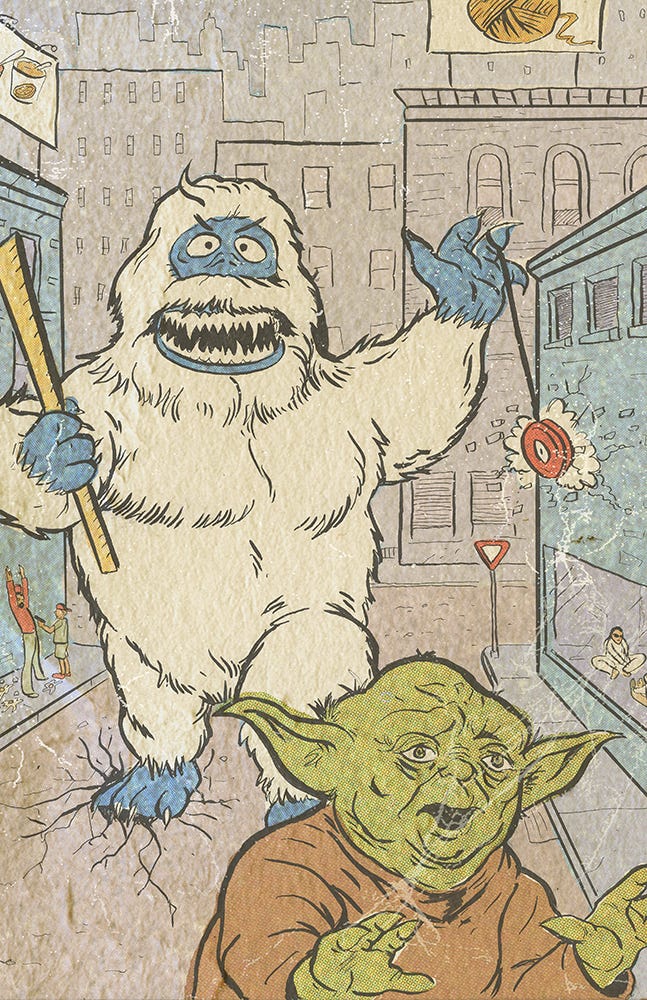
For the rest of the semester, I did all my work in this same style, and, in spite of it being as comic book-y as possible, I never once heard again “it’s too comic book-y” as the critique. The style didn’t come from outside, but naturally from within.
I still have a few of these 20-year-old pieces on my website portfolio.
20 years later, I’m still working in this style, and, for better or worse, have become known for it.
Next time I’ll get a little more into what daily life, and FUN was like in those art college days. For now, I’ll just say thank you for reading, I love you.


